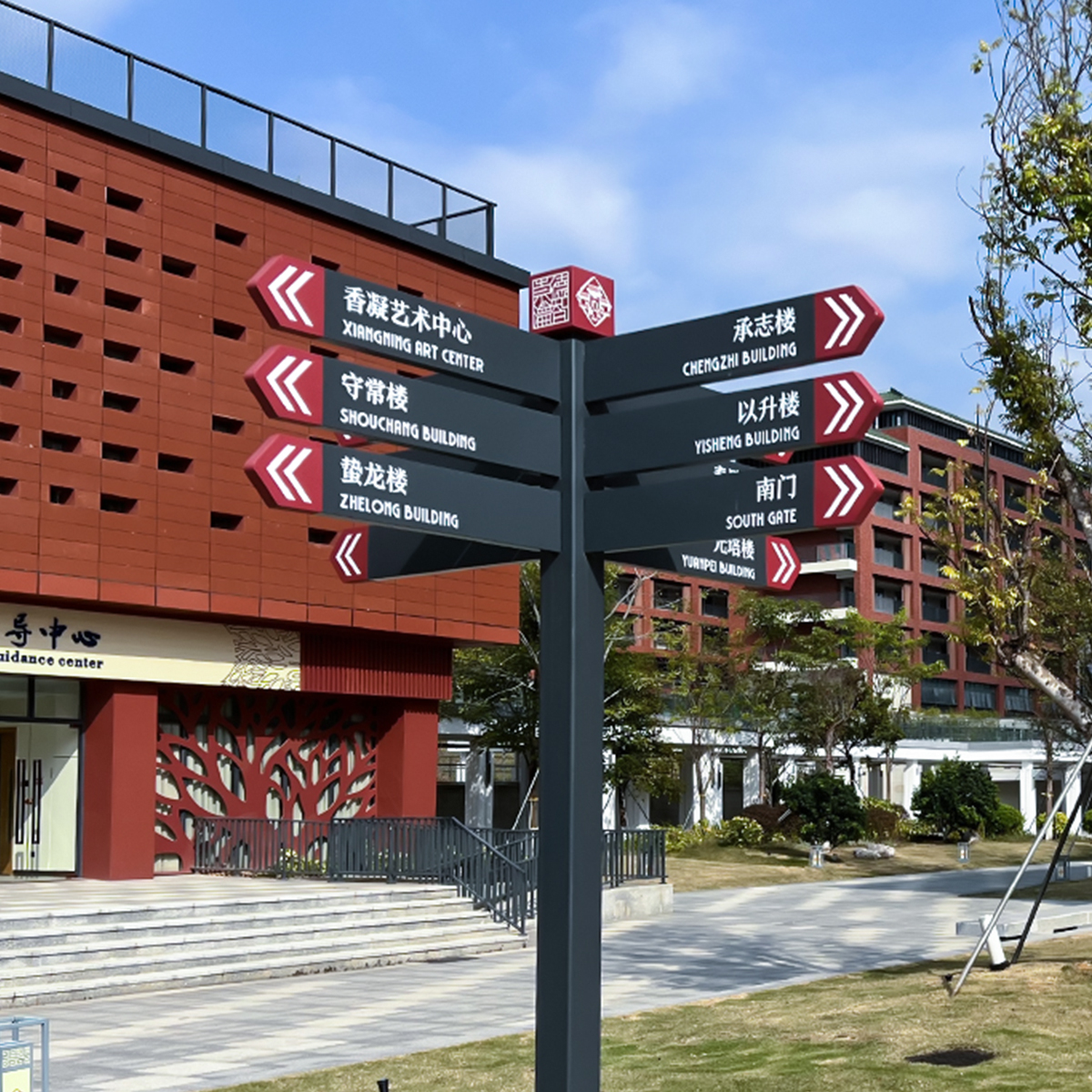
User-first framing: why signs must think like people
Designers and facility managers win when signs reduce friction for real users — not when they simply fill space. A pylon sign in a busy transit hub, hospital, or shopping district acts like a human assistant: it must account for sightlines, motion, and split-second decisions. That’s where clear tactile cues and readable visual hierarchy matter. For projects that require accessibility at scale, consider ada braille signs early in the brief so accessibility isn’t an afterthought.
.jpg)
How biomechanics guides practical wayfinding
Visual navigation depends on how people move their heads and eyes while walking, driving, or wheeling through space. Effective pylon signs use contrast, large type, and pictograms to match those movement patterns. Industry terms here include tactile characters, mounting height, and grade 2 Braille — small technical choices that change whether a user locates an entrance in three seconds or three minutes. The Americans with Disabilities Act (2010) provides a regulatory anchor: tactile and Braille on permanent room signs are required, which makes compliance a baseline, not a luxury.
Real-world anchors that prove the point
Look at major transportation hubs such as Union Station or a large hospital complex where wayfinding succeeds most when signs are predictable and consistent. Empirical observation shows fewer missed turns and less congestion when pylon signs combine large copy with tactile markers and clear sightlines. A CDC estimate — that roughly one in four adults has some disability — underscores the social impact: accessible signage helps a significant portion of the population navigate independently.
Design choices that actually help people
Focus on three practical elements: contrast and type size, tactile information, and placement relative to pedestrian flows. Good design pairs a bold visual hierarchy with tactile characters for touch confirmation. Pictograms speed recognition across languages. Mounting height should follow ergonomic norms so people of different heights and mobility can access information easily. Small changes here reduce hesitation and speed movement through crowded zones.
Common mistakes and how to avoid them
Too many projects treat braille and tactile features as add-ons. That approach creates inconsistent systems that frustrate users. Avoid these pitfalls:
– Crowded content: too many destinations on one panel confuses sightlines and slows decision-making.
– Low-contrast materials: glossy finishes and weak contrast ruin legibility in varied lighting.
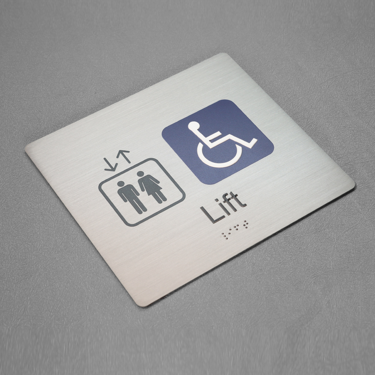
– Inconsistent placement: signs at different heights or offsets break learned wayfinding patterns — which forces users to search rather than move. — A simple alignment rule across all pylon signs makes navigation intuitive.
Comparing materials and fabrication for durability
Aluminum and high-density acrylic remain solid choices for pylon signs because they balance legibility with weather resistance. Engraved tactile characters and encapsulated Grade 2 Braille stand up to cleaning and public use. Choose matte finishes to reduce glare and keep pictograms sharp; that preserves the visual cues commuters rely on.
Integration with broader navigation systems
Wayfinding succeeds when pylon signs connect to maps, digital directories, and staff training. Physical signs anchor the experience: people often validate a path they saw on a phone by checking the pylon sign in front of them. For room-level identification, pairing corridor signs with ada braille room number signs creates predictable, human-scale patterns that minimize stops and clutter.
Advisory: three golden rules for selecting wayfinding solutions
1) Legibility first: prioritize contrast, type size, and pictogram clarity. Measure expected viewing distance and set type accordingly — that yields measurable reductions in hesitation.
2) Accessibility as design intent: require tactile characters and Grade 2 Braille in initial specs, not in revisions. This avoids expensive retrofits and keeps systems consistent across pylon signs.
3) Durable coherence: pick materials and mounting standards that hold up to cleaning and traffic while locking in placement standards across the site.
These rules translate directly into less congestion, fewer help-desk calls, and a smoother user experience — which is why thoughtful partners matter. Cosun Sign designs with those principles integrated, offering durable, code-aware solutions that make navigation simple and reliable — clear, consistent, human-centered.