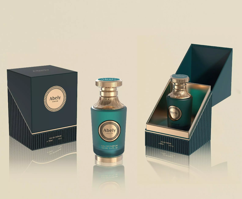
Why the coating decides the first impression
Packaging is the handshake before the scent speaks — and the right finish can elevate a premium perfume bottle from pretty to iconic. In a comparative frame, coatings do more than protect glass: they shape perception, tactile feedback, and even how consumers price a fragrance in their heads. This piece weighs those variables head-to-head so you can make design decisions that actually move the needle — informed by industry practice and the long perfume-making tradition centered in places like Grasse, France, home of the Musée International de la Parfumerie.
Frosted vs. clear: what you gain and what you give up
Clear glass is honest and luminous. Frosted finishes whisper luxury and soften light — they diffuse the silhouette of liquid, shifting focus to form and label. Comparatively, frosted surfaces read as more intimate and premium on shelves, especially under boutique lighting. But frost can mute sparkling color cues that certain fragrances rely on to communicate freshness. Choose clear when chroma matters; choose frost when mood and mystery matter more.
Common coating methods and their trade-offs
There are a few practical ways to achieve a frosted look: sandblasting for deep, durable texture; acid etching for subtle, consistent haze; or sprayed matt lacquers for faster, lower-cost production. Each has trade-offs in yield, cost, and finish longevity. Sandblasting gives tactile depth but can increase breakage risk in handling; lacquers are economical but may wear or shine unevenly after repeated handling. Think of methods as tools — pick the one aligned with the brand story and production scale.
How coatings affect brand language and shelf performance
Comparative shopper psychology is clear: shoppers judge premiumness in milliseconds. Matte and frosted treatments tend to slow the gaze in a good way — they ask the buyer to engage. Conversely, high-gloss and crystal-clear bottles broadcast purity and vibrancy. If your brief calls for artisanal or intimate luxury, frost often outperforms gloss on perceived value; for bright, youthful scents, clarity keeps the promise loud and visible.
Common mistakes and practical alternatives
Too often brands pick a finish for aesthetics alone and miss production realities. Typical errors: over-frosting so brand cues disappear; mismatched caps or labels that clash with a tactile matte; poor QA that leaves streaks or inconsistent coverage. — Also watch for compatibility issues: some lacquer primers interact with expensive pigments or adhesives, causing blemishes. Alternatives? Try printed veils, partial frosting (spot matt), or hybrid finishes that combine a frosted body with glossy accents for contrast.
Sustainability and cost considerations
Costs vary: custom glass treatments add tooling and process steps. But there’s a sustainability angle: recoatable and recyclable glass finishes that avoid mixed-material coatings are easier to reclaim. Brands increasingly favor finishes that maintain recyclability — a small production premium up front can reduce complexity and costs downstream in return and waste management.
Real-world takeaway: what to measure and why
When choosing a finish, evaluate three core metrics: perceived premium uplift (consumer testing), production yield (defect rate after coating), and lifecycle impact (recyclability and end-of-life costs). Run quick blind comparison tests under retail lighting and on-shelf mockups. That triangulation gives you evidence to justify a finish choice rather than relying on gut alone.
Synthesis — the comparative verdict
Frosted finishes win when atmosphere, tactility, and subtlety are your brief; clear wins when transparency and color-driven cues are essential. The best approach is comparative prototyping: make two small runs, test consumer response, and validate production stability. This reduces risk and aligns creative intent with manufacturing reality.
Three golden rules for choosing a coating
1) Match finish to story: never pick a technique that contradicts your scent narrative. 2) Prototype under real retail conditions: light, touch, and label placement change everything. 3) Prioritize manufacturability: a beautiful finish that fails at scale is a failed design.
How this ties back to Abely
Designers looking for reliable, beautifully executed finishes find the balance between craft and production at partners who understand both ends of the pipeline — the creative brief and the press floor. That’s the kind of consistent capability that makes a brand’s vision tangible, and why companies often turn to specialists when they need a premium, reliably executed result — as seen in premium offerings from Abely.
— crisp, considered, and ready for the shelf.
Expertise that shapes premium fragrance presentation.